Art for All Exhibition in the Ucheldre Centre Holyhead Activities, Exhibitions / 2017-08-04 Art for All Exhibition in the Ucheldre Centre Holyhead Read More »
MoMA Course Completed… “In the Studio: Postwar Abstract Paintings” Abstracts, Subjects / 2017-07-17 MoMA Course Completed… “In the Studio: Postwar Abstract Paintings” Read More »
New Painting: Up and Down South Stack Steps (Triptych) Finished Artwork, Landscapes, Subjects / 2017-07-12 New Painting: Up and Down South Stack Steps (Triptych) Read More »
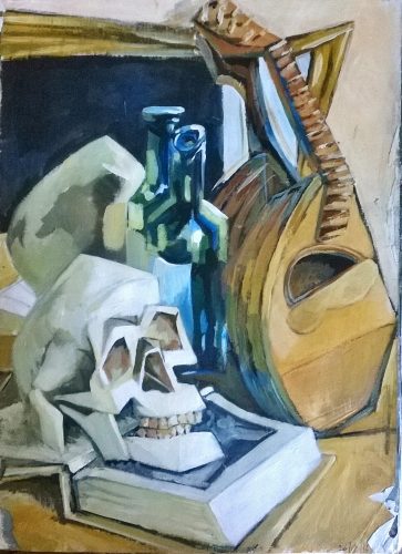
Sketchbook: Still Life with Skull and Mandolin Sketch, Still Lifes, Subjects / 2017-06-27 Sketchbook: Still Life with Skull and Mandolin Read More »
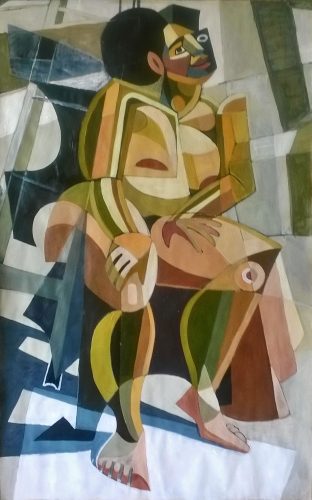
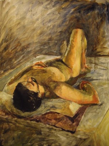
More Pictures added to the Figures Gallery Figures, Subjects / 2017-06-20 More Pictures added to the Figures Gallery Read More »
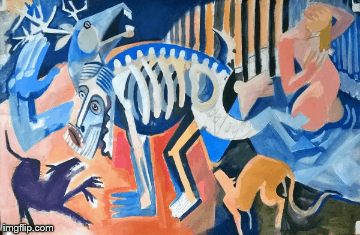
Diana and Actaeon Development Development, Mythology, Subjects / 2017-06-20 Diana and Actaeon Development Read More »
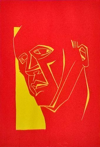
New Linocut Reduction Print: Red Head Finished Artwork, Printmaking, Subjects / 2017-06-20 New Linocut Reduction Print: Red Head Read More »
Diana and Actaeon: Spot the Pun Answer Mythology, Subjects / 2017-06-19 Diana and Actaeon: Spot the Pun Answer Read More »
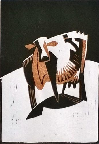
New Linocut Reduction Print of a Cow Finished Artwork, Printmaking, Subjects / 2017-06-19 New Linocut Reduction Print of a Cow Read More »