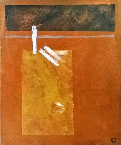
Finished Painting – The Sculpture Garden II Abstracts, Figures, Landscapes, Sketch / 2018-06-19 Finished Painting – The Sculpture Garden II Read More »
MoMA Course Completed… “In the Studio: Postwar Abstract Paintings” Abstracts, Subjects / 2017-07-17 MoMA Course Completed… “In the Studio: Postwar Abstract Paintings” Read More »
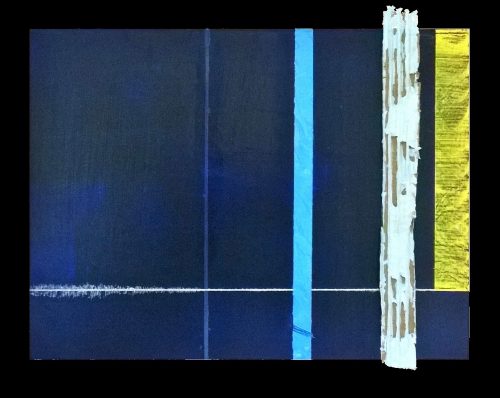
New Painting: Abstract South Stack Lighthouse Abstracts, Finished Artwork, Landscapes, Subjects / 2017-06-18 New Painting: Abstract South Stack Lighthouse Read More »