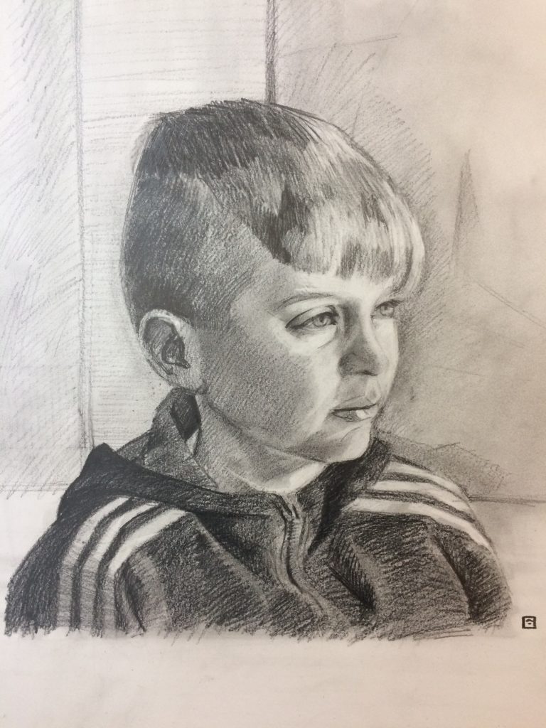
Live Portrait Commission: Connor Drawing, Graphite, Live Demos, Open Studios / 2018-04-05 Live Portrait Commission: Connor Read More »
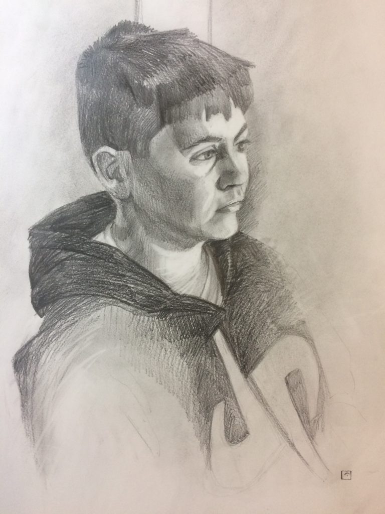
Live Portrait Commission: Cieran Drawing, Graphite, Live Demos, Open Studios / 2018-04-05 Live Portrait Commission: Cieran Read More »
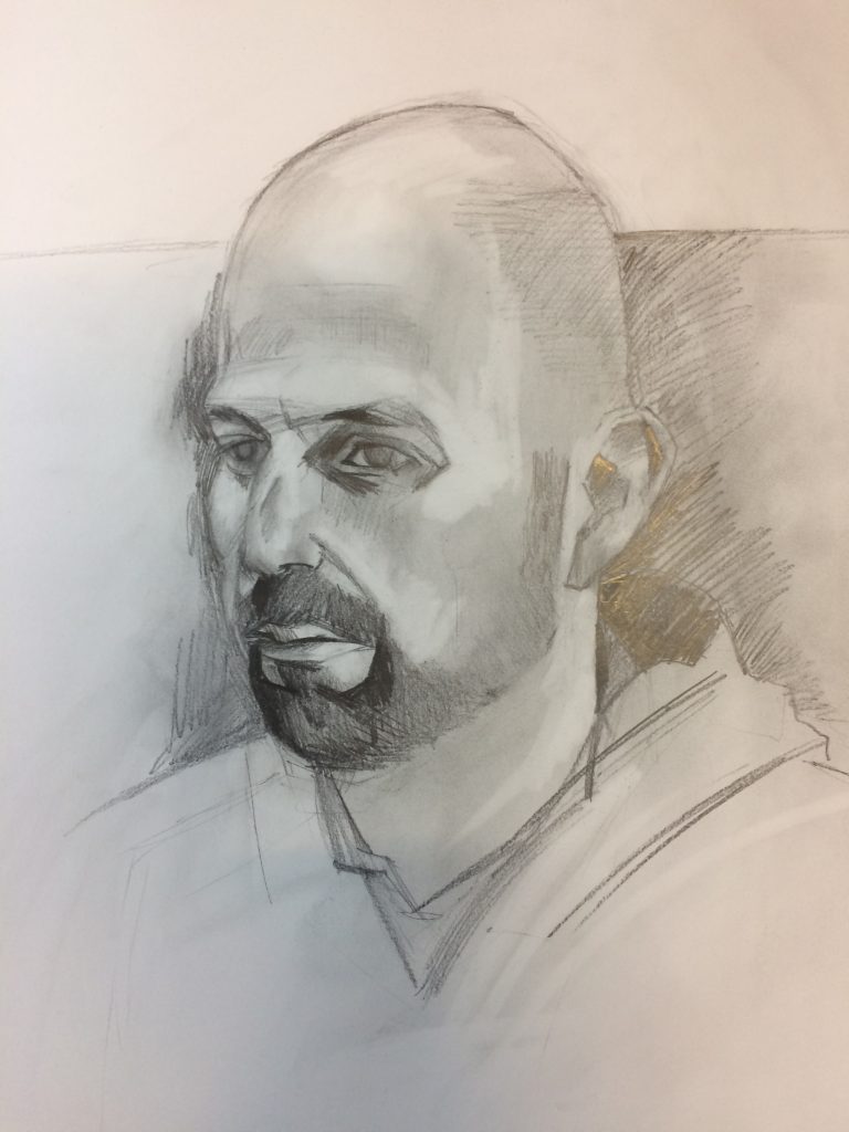
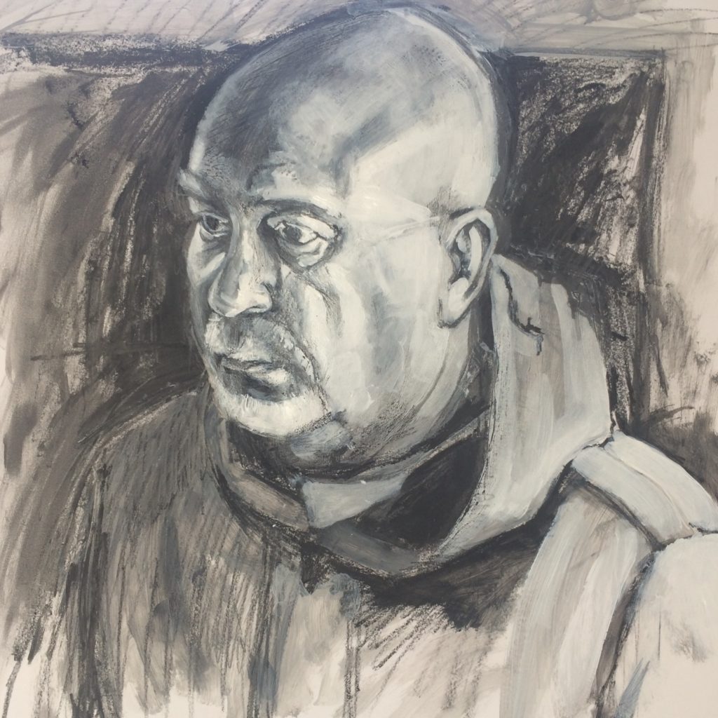
Live Portrait Demo Live Demos, Open Studios, Work In Progress / 2018-03-29 Live Portrait Demo Read More »
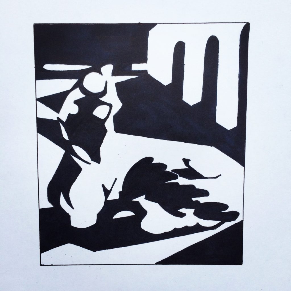
Savvy Painter Growth Studio 21 Day Notan Challenge Drawing, Studio Practice / 2018-03-13 Savvy Painter Growth Studio 21 Day Notan Challenge Read More »
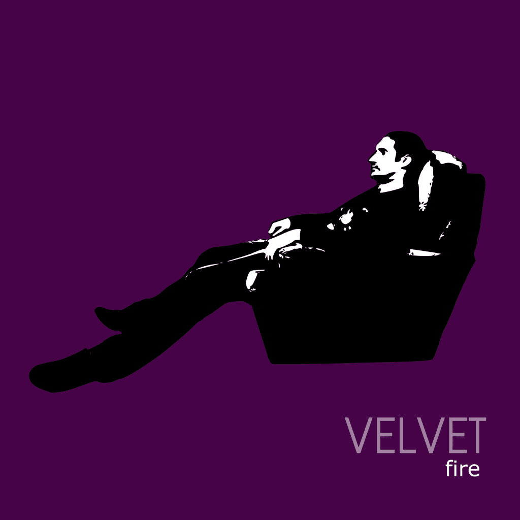
New Album Artwork: Fire by Velvet Drawing, Finished Artwork / 2017-12-02 New Album Artwork: Fire by Velvet Read More »
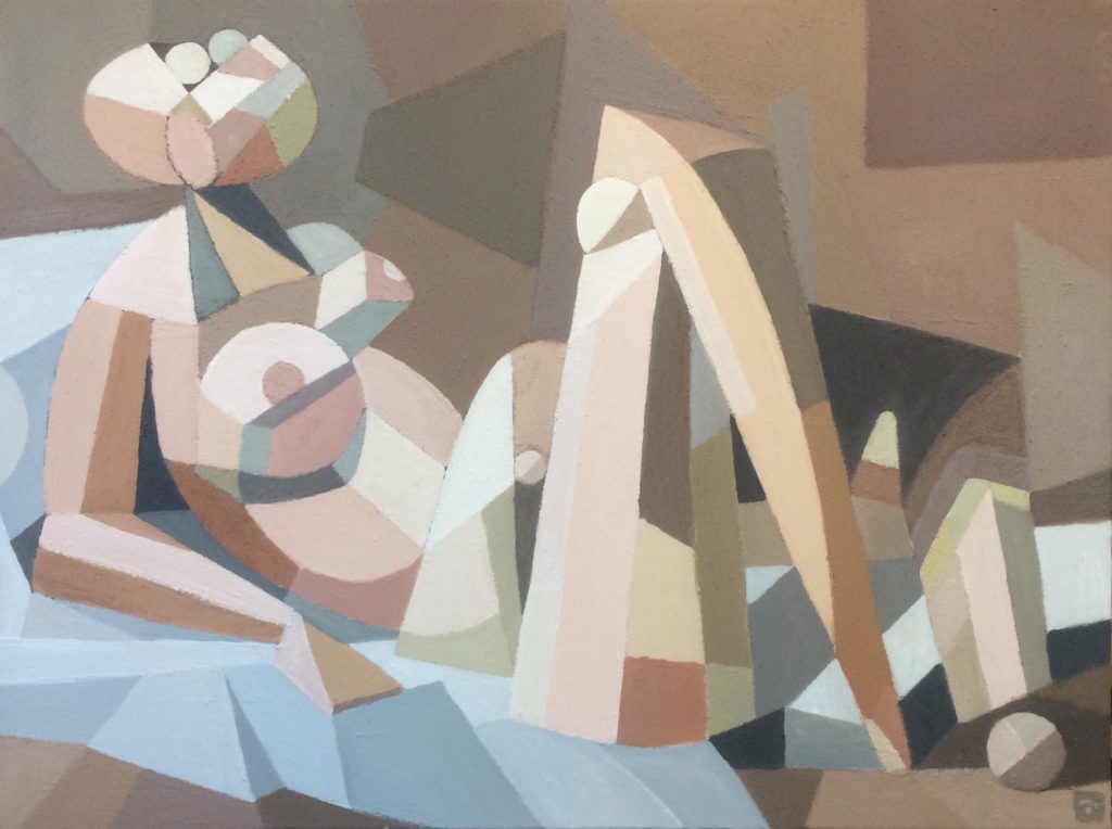
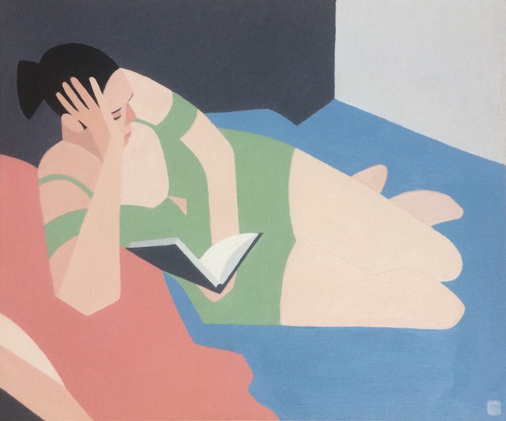
New Painting: Reclining Nude II Figures, Finished Artwork, Subjects / 2017-12-02 New Painting: Reclining Nude II Read More »
New Painting: Reclining Figure I Figures, Finished Artwork, Subjects / 2017-12-02 New Painting: Reclining Figure I Read More »