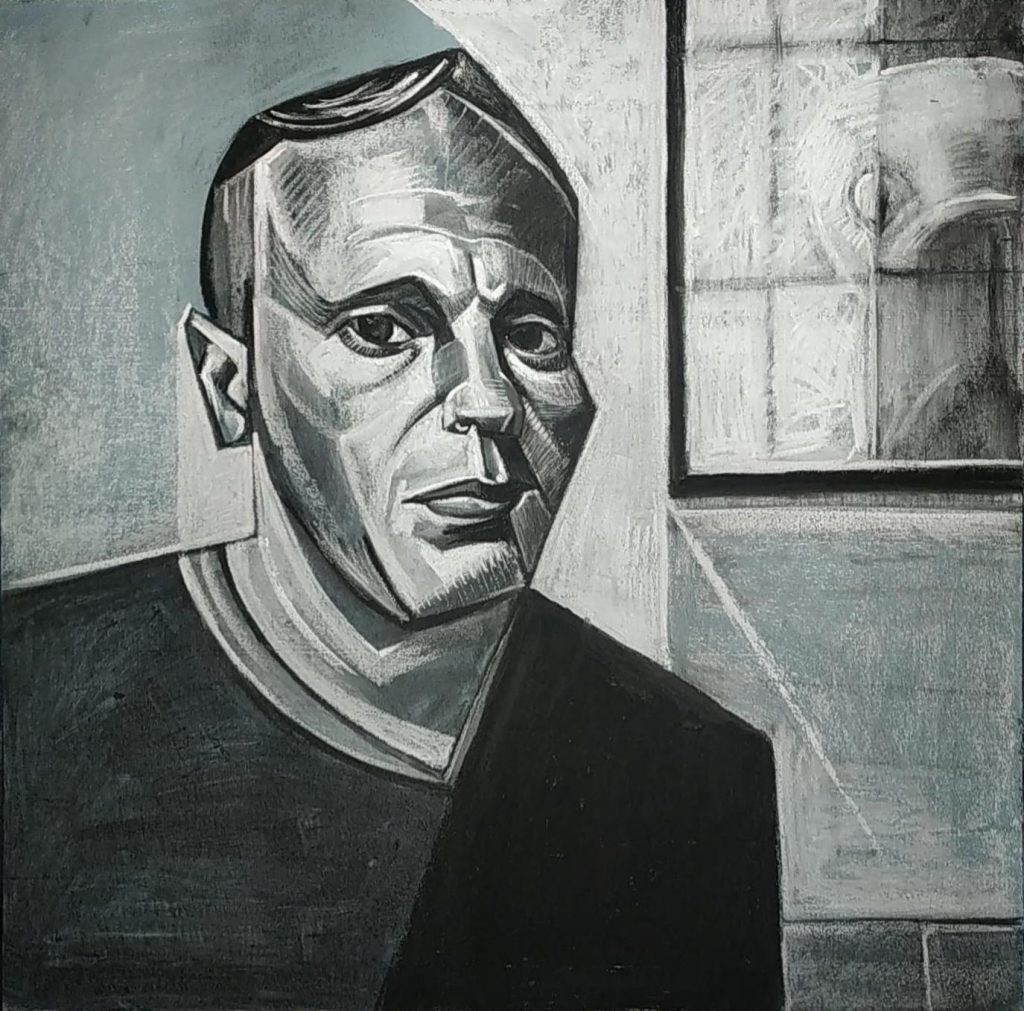
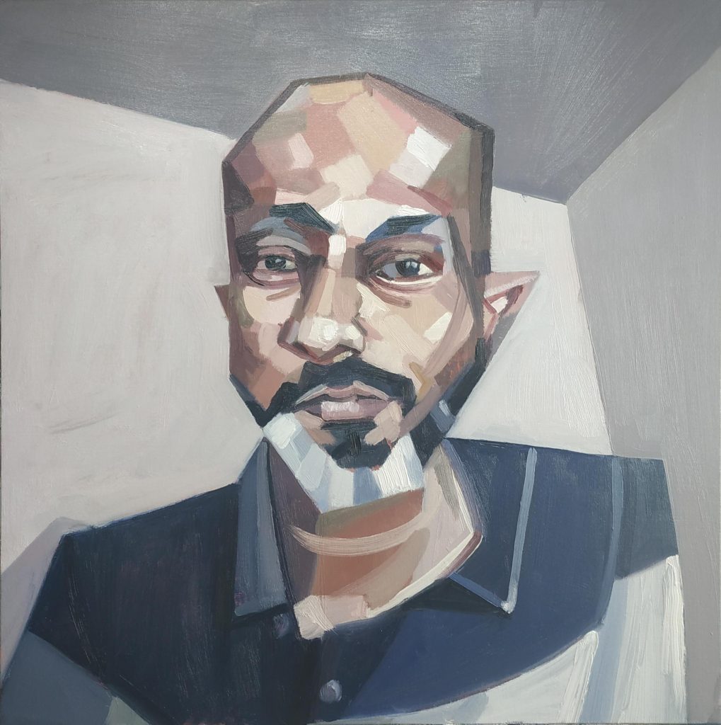
3rd Place in SkyArts Portrait Artist Of The Week Awards, Drawing, Portraits / 2020-06-03 3rd Place in SkyArts Portrait Artist Of The Week Read More »
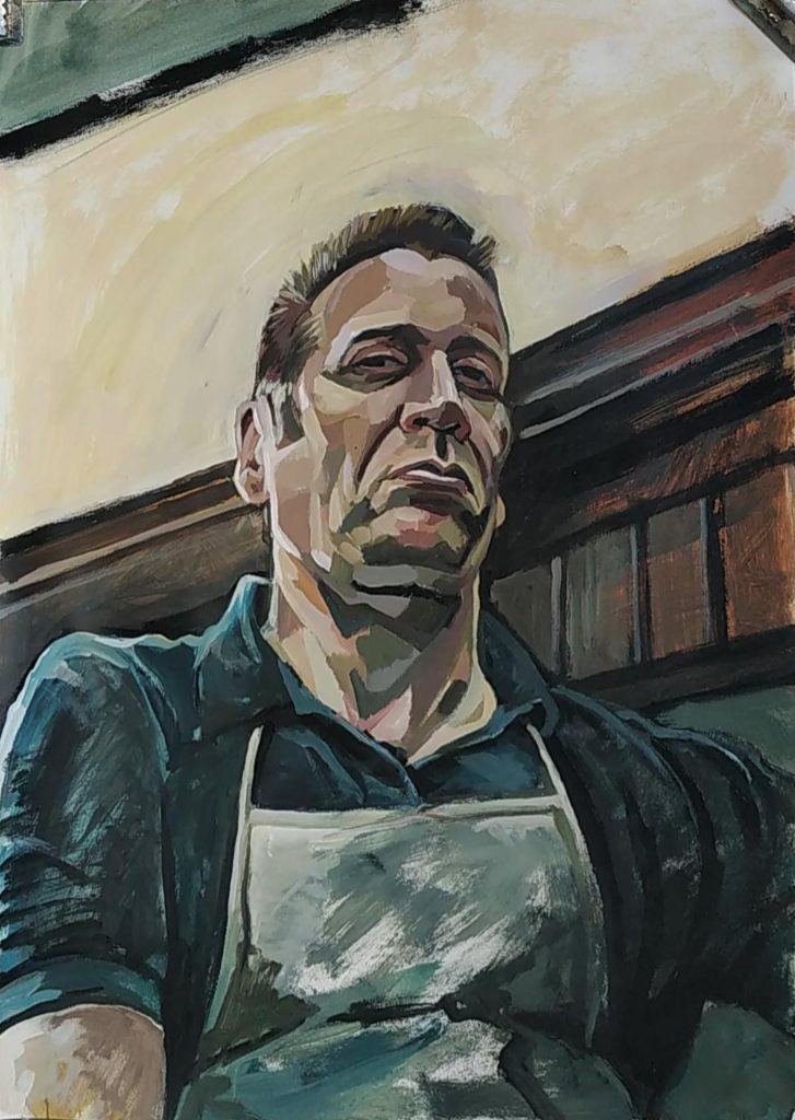
SkyArts Portrait Artist of the Week 4 Portraits, Studio Practice / 2020-05-17 SkyArts Portrait Artist of the Week 4 Read More »
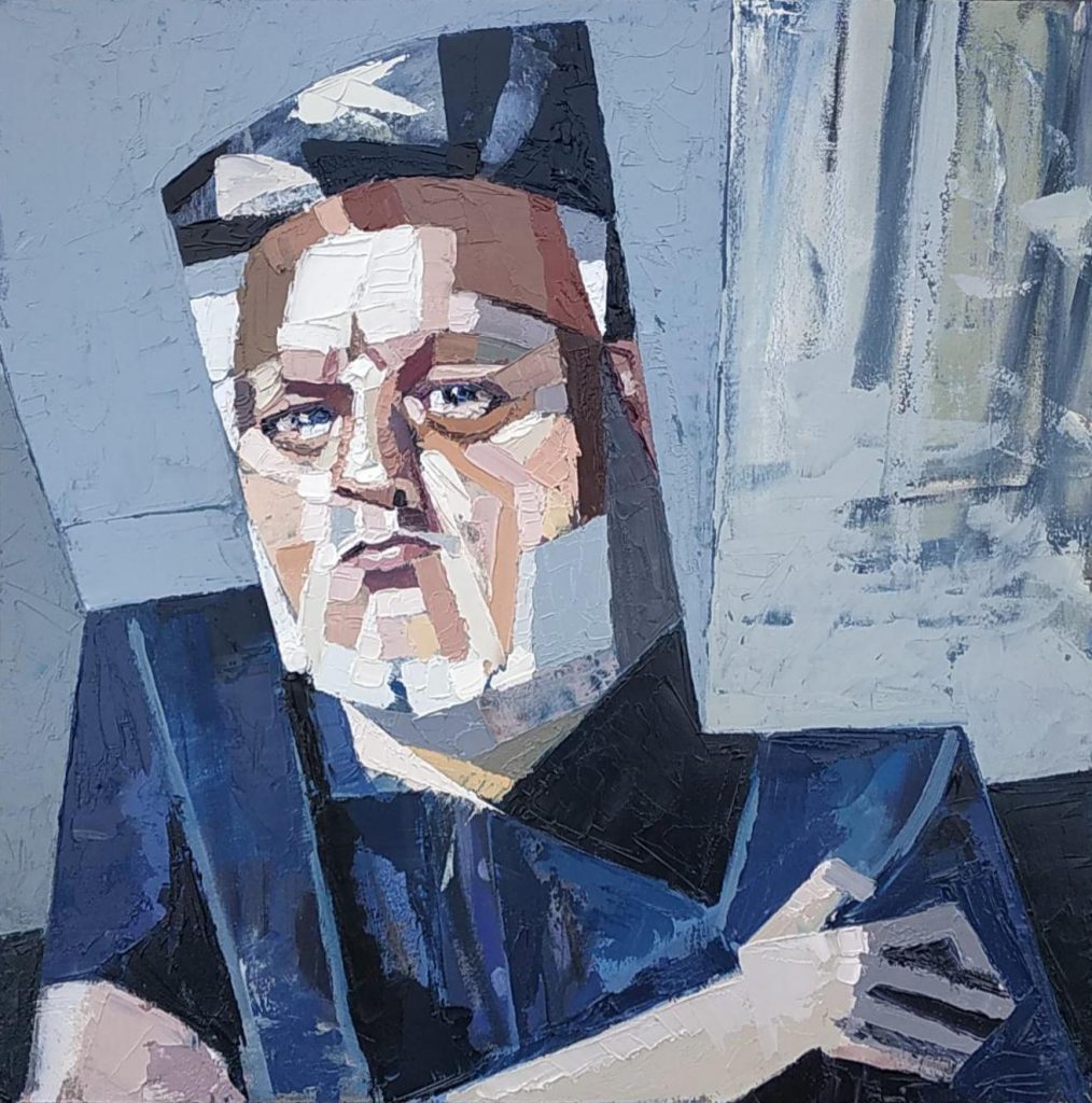
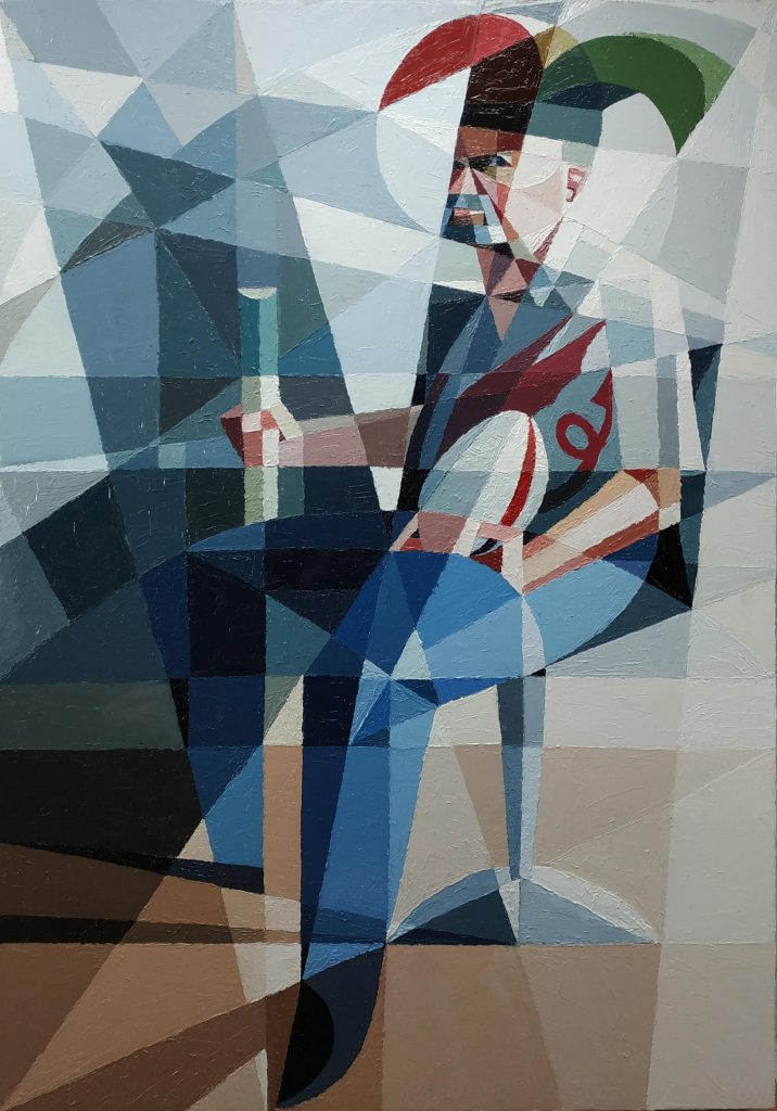
SkyArts Portrait Artist of the Week 3 – Reworked Oils, Painting, Portraits, Studio Practice / 2020-05-17 SkyArts Portrait Artist of the Week 3 – Reworked Read More »
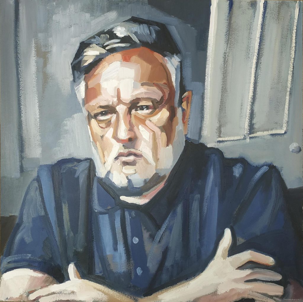
SkyArts Portrait Artist of the Week 3 Oils, Painting, Portraits, Studio Practice / 2020-05-17 SkyArts Portrait Artist of the Week 3 Read More »
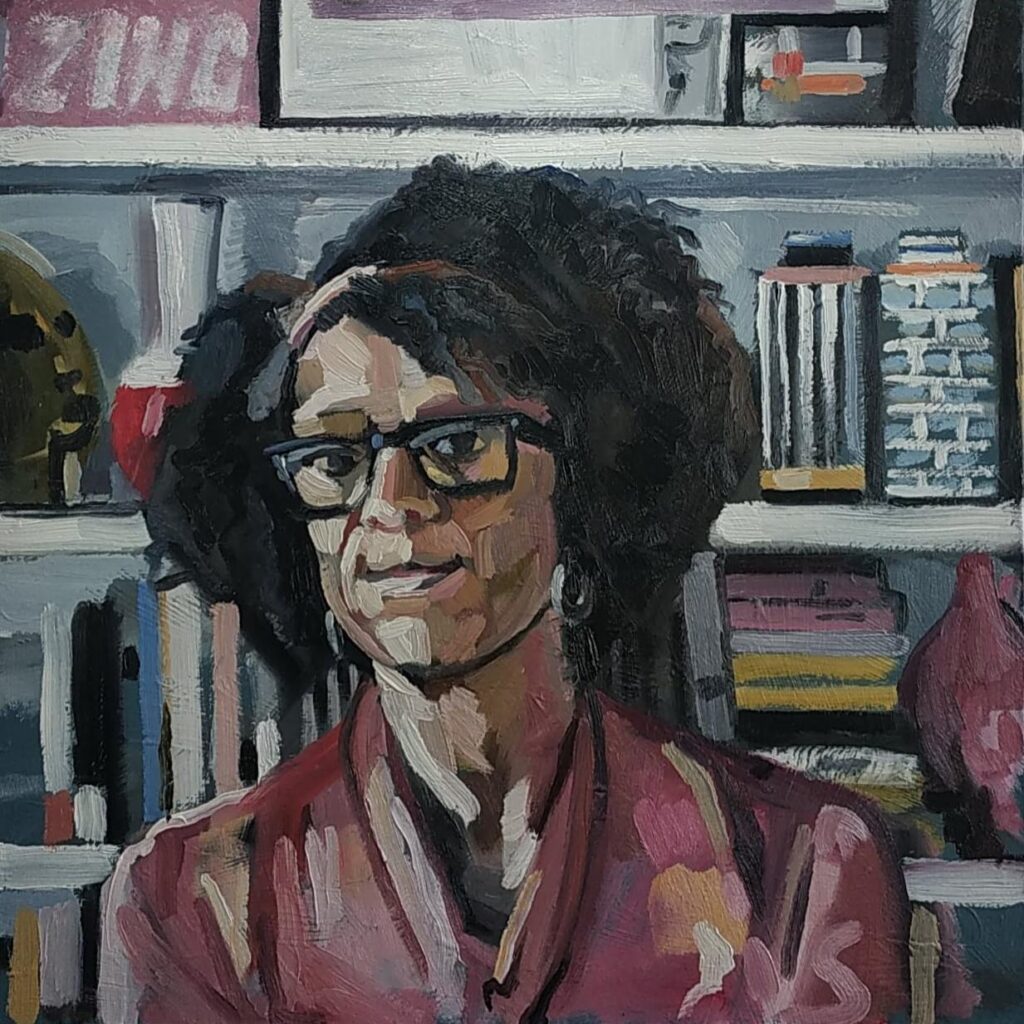
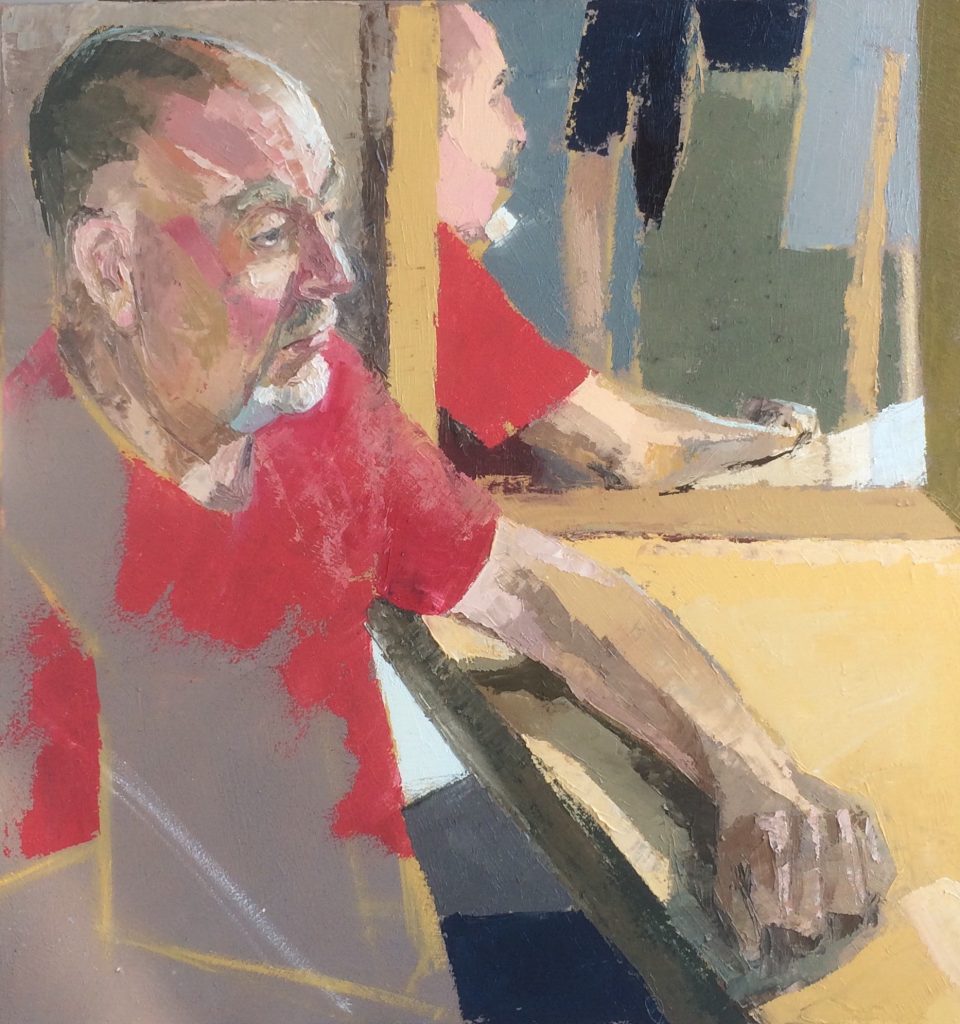
SkyArts Portrait Artist of the Week 2 Oils, Painting, Portraits, Studio Practice / 2020-05-03 SkyArts Portrait Artist of the Week 2 Read More »
SkyArts Portrait Artist of the Week 1 Oils, Painting, Portraits, Studio Practice / 2020-04-27 SkyArts Portrait Artist of the Week 1 Read More »
Portrait Practice 29/08/2018 Portraits, Studio Practice / 2018-08-29 Portrait Practice 29/08/2018 Read More »