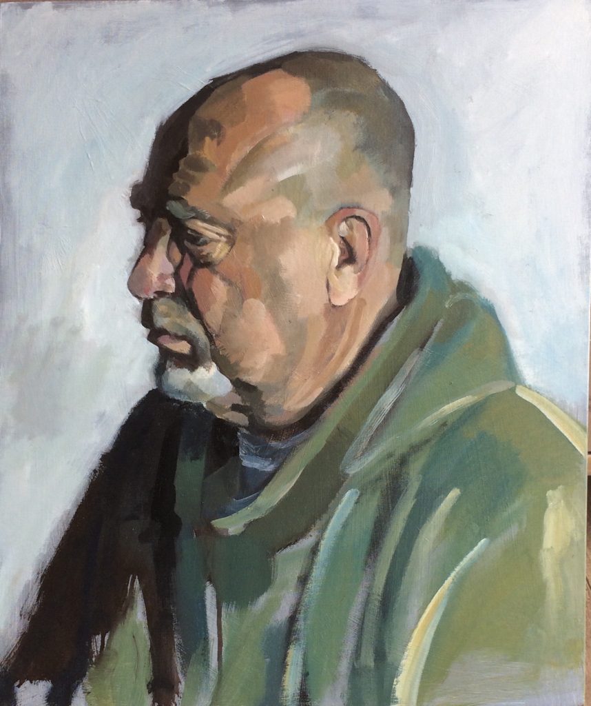
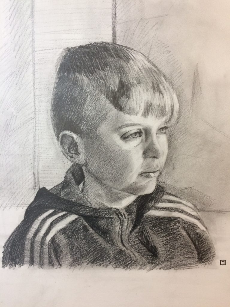
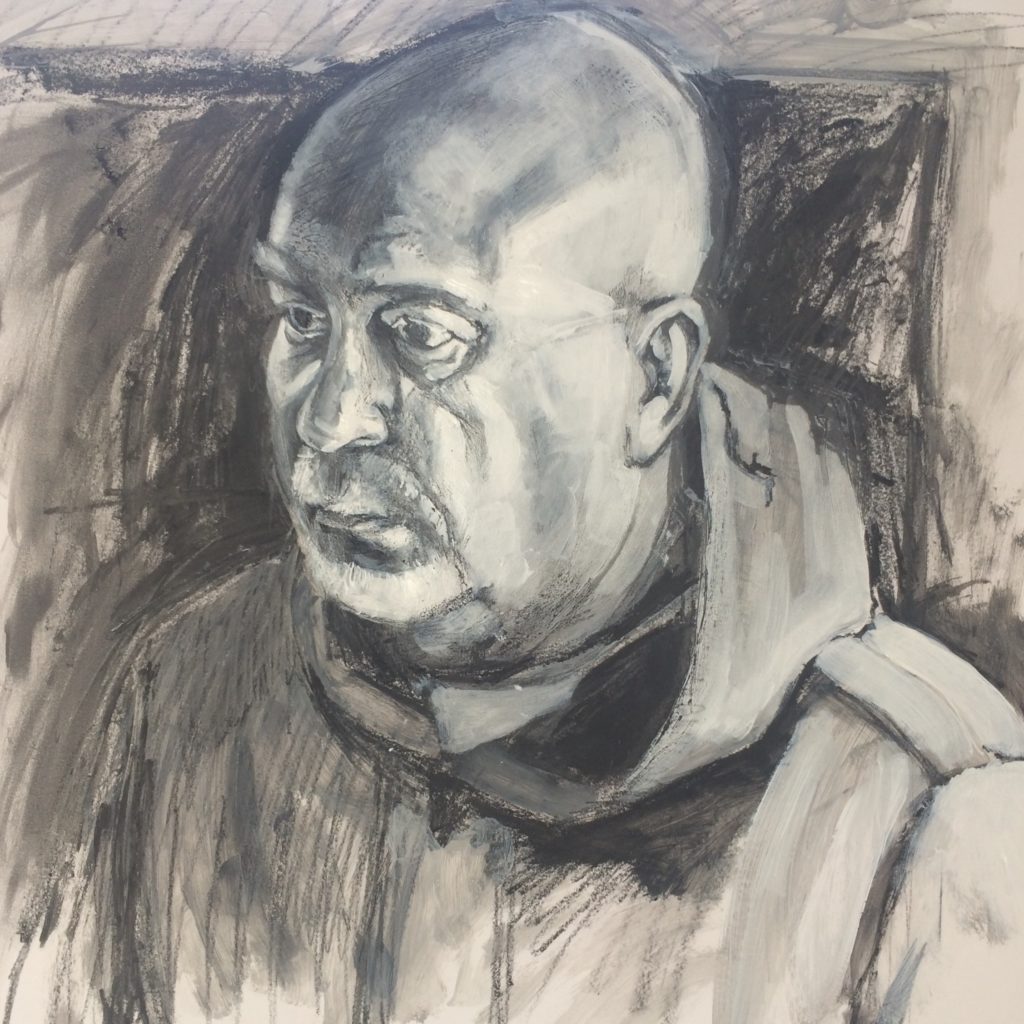
Portrait Practice 17/04/2018 Portraits, Studio Practice / 2018-04-17 Portrait Practice 17/04/2018 Read More »
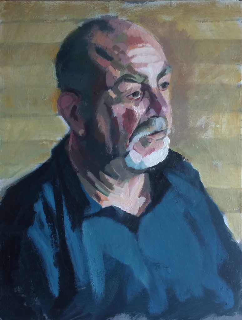
Portrait Practice 16/4/18 Portraits, Studio Practice / 2018-04-16 Portrait Practice 16/4/18 Read More »
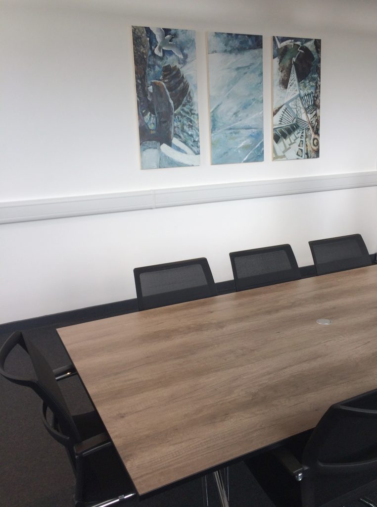
Up and Down South Stack Steps in the New Boardroom at Loyalty Logistix Ltd Artwork In Situ / 2018-04-12 Up and Down South Stack Steps in the New Boardroom at Loyalty Logistix Ltd Read More »
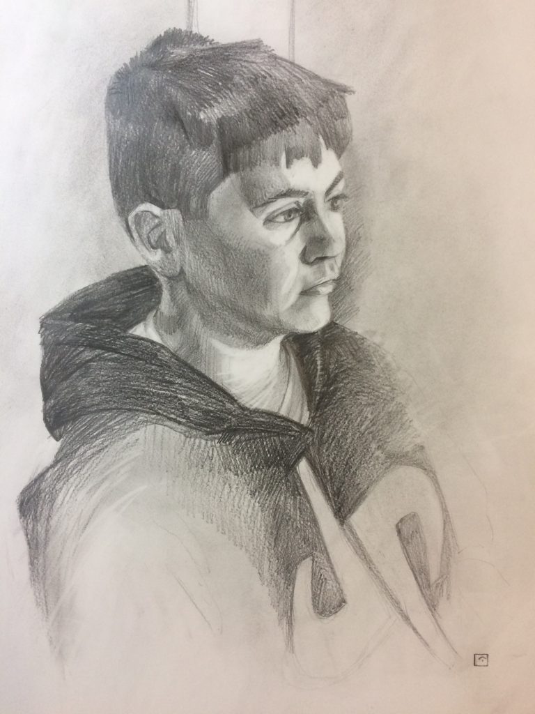
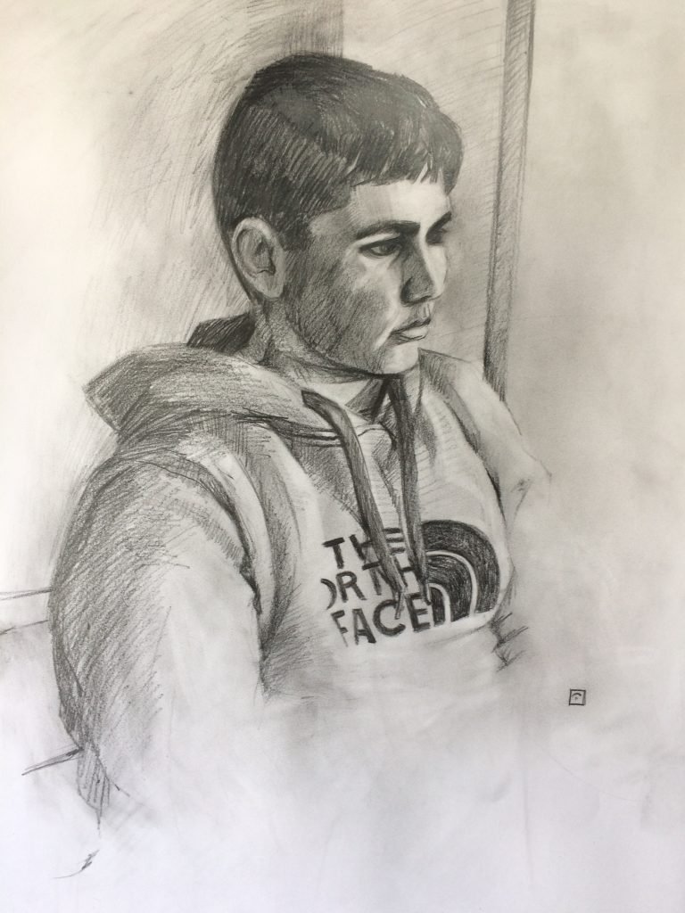
Live Portrait Commission: Connor Drawing, Graphite, Live Demos, Open Studios / 2018-04-05 Live Portrait Commission: Connor Read More »
Live Portrait Commission: Cieran Drawing, Graphite, Live Demos, Open Studios / 2018-04-05 Live Portrait Commission: Cieran Read More »
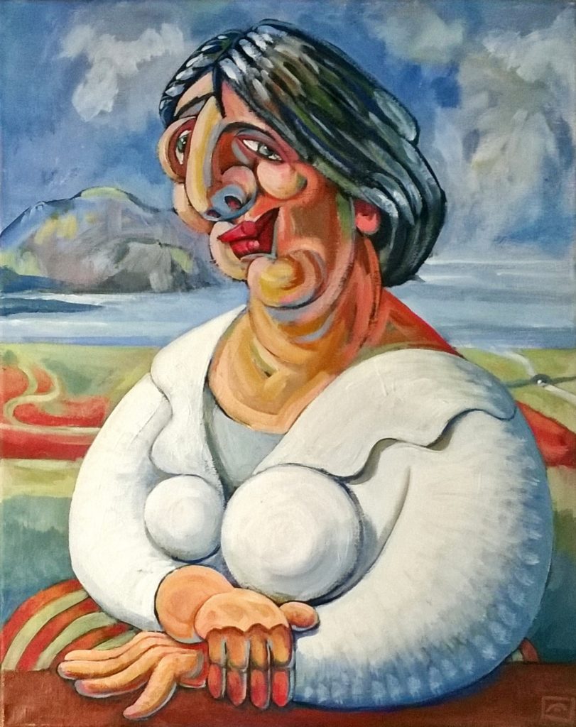
Ynys Mon Y Lisa Discovered in Anglesey Garage Open Studios / 2018-04-01 Ynys Mon Y Lisa Discovered in Anglesey Garage Read More »
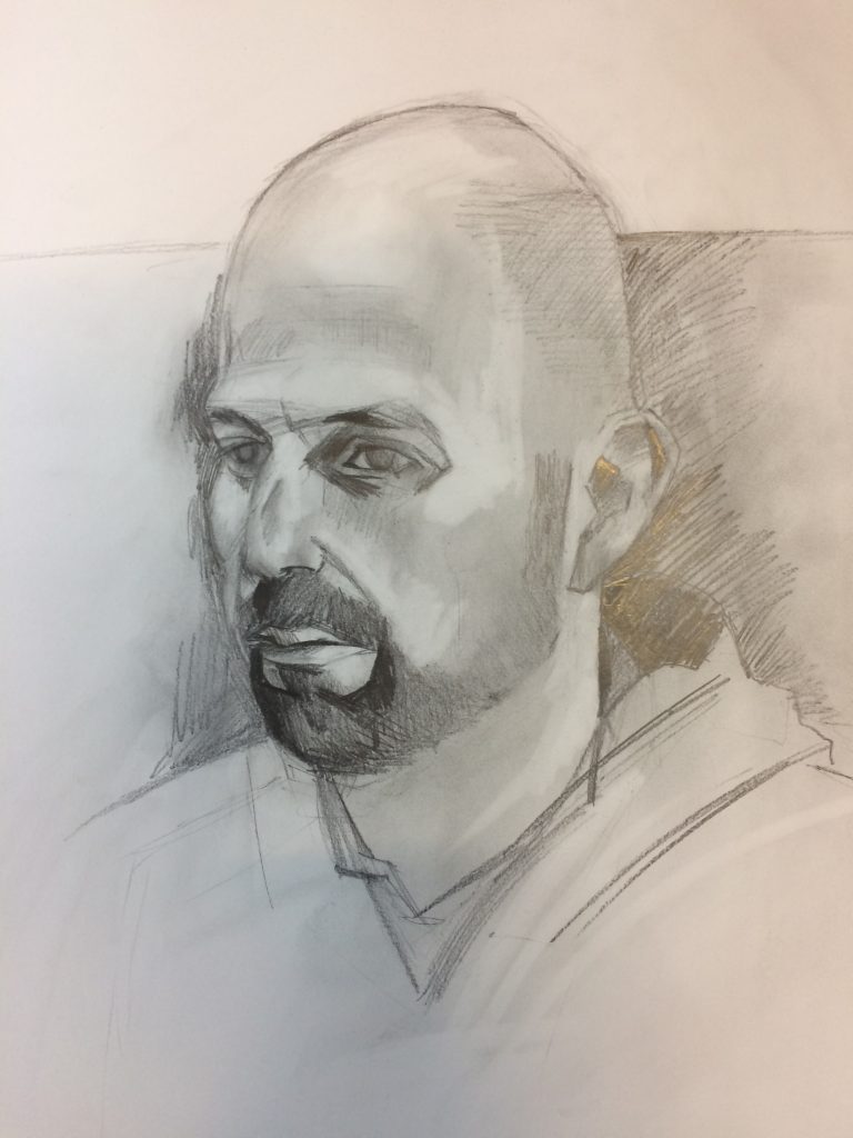
Live Portrait Demo Live Demos, Open Studios, Work In Progress / 2018-03-29 Live Portrait Demo Read More »