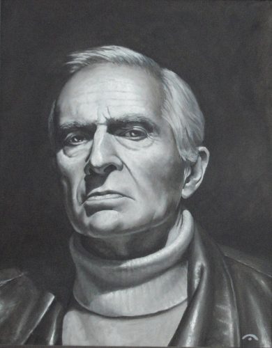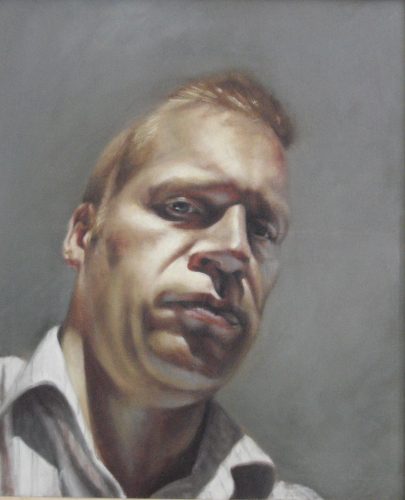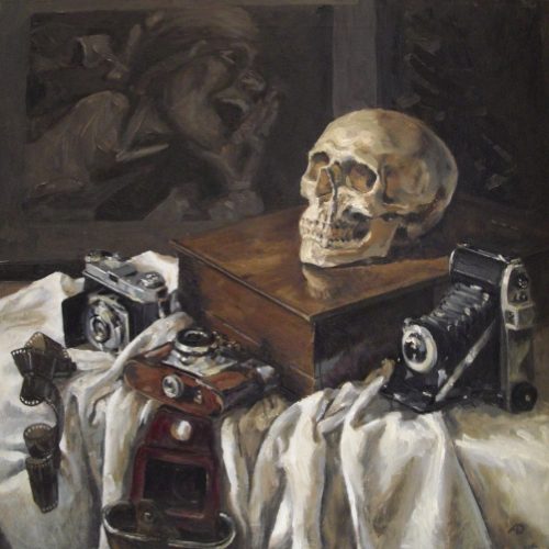
This is my latest painting of Paul Jennings. It’s an attempt to reflect on some of the fascinating discussions we’ve had during our portrait sessions over the last 8 months.
It attempts to raise questions about how we see ourselves and how others see us, a subject which feels especially pertinent in the current climate. I hope to expand on the thinking behind this in a future post.
In terms of the approach taken to the painting, the colour ‘shapes’ are intended to pay homage (yet again) to Picasso’s stated aim of trying to create a painting which could be cut up and reassembled, using the ‘visual indications‘ to create a sculpture.
I’d hope to think that the viewer is always aware of how incomplete/flat/crudely painted the area ‘in focus’ is, but that they also gain the sensation that areas viewed ‘peripherally’ seem to make visual sense, until attention is redirected to them and they, too, suddenly stop making sense (a bit like a faint star that can’t be seen directly).
Initially, a basic geometric ‘framework’ was hand drawn, with the intention of suggesting the space around, and relationships between, objects and their environment, the goal being to direct the eye around the painting. As a result, the eye is seldom given a chance to rest, until it’s suddenly brought to a shuddering halt when the ‘lines of force’ intentionally peter out, and the viewer is – once again – confronted with the flatness of the surface.
Over time, the figure and shadows were allowed to ‘evolve’ to align, where applicable, with these lines of force.
This was brought to mind by Richard Verdi‘s description of Cezanne’s intentional alignment of the edges of foreground objects, such as apples or vases, with background elements, such as patterns on wallpaper which, once again, offers the viewer a challenge to consider both flatness and depth.
During the production of this painting, I was also thinking about David Hockney’s multiple-viewpoint photographic ‘joiners‘ including ‘Pearblossom Highway‘ and, especially, the comparison between Hockney’s dynamic/living photo-montage of Annie Leibovitz’ making preparations for taking his photograph, and Leibovitz rather static end result (see slide 13).
Finally, painting in varying thicknesses of impasto using a palette knife brought to mind the figure/ground ‘experiments’ of the Abstract Expressionist, Barnett Newman, who incorporated thin vertical lines, or ‘zips’ as he referred to them,in his paintings. I really like the idea of using different thicknesses of paint to subvert the principle of the figure/foreground v background relationship,so that elements that should be further back ‘pictorially’, are ‘physically’ closer to the viewer, even if it is only by a few microns depth of paint layers.


